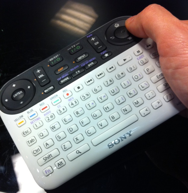
I tried out Sony’s Google TV solution at a Sony store today. No, make that: I tried to try out Sony’s Google TV solution. I wanted to write a quick post today about my first thoughts on it, but I can’t, because I spent more time trying to figure out the darned remote than I did actually using it.
The remote is a perfect example of “too much of a good thing.” 90% of the buttons are only needed very occasionally, which means for most basic tasks (like, say, watching TV) it’s just a lot of wasted and confusing space. And when you do need to use one of the extra buttons, it’s not-at-all obvious which button is the right one to press. I had to **gasp** ask a sales guy for help with something as simple as moving the cursor when using the Google TV web browser (the answer: the large round button on the upper right doubles as a mini touch-pad — cool, but not the least bit intuitive).
I still want to try Google TV at home at some point, but based on my five minutes with Sony’s solution, I’m now leaning towards giving Logitech’s Google TV box a try. Its remote interface has to be better, right?

